
How to pick a colour scheme for your MVP that's a little bit like cheating
In this post, we’ll discover how colour can be used to subconsciously influence how your users feel about your minimum viable product. We’ll see how colour can be used as a short-cut to your user’s brain, gently encouraging them to have the desired response when using your application or website.
Picking a colour scheme that looks good, and suits your app’s theme, character and market, can be a massive sticking point for indie developers and pros alike. Ask anyone who’s tried to build an idea, and they’ll tell you how easy it is to sink weeks worth of energy into things like colour schemes, logos and app names. However, at this very early stage of development, it’s important not to get bogged down in these decisions, or you run the risk of losing momentum.
At the same time, the right colour decisions now can be a huge help in guiding your users to success. In this 5-minute post I’ll show you how to pick a colour scheme in minutes that looks good, inspires the appropriate action from your users, and lets you get back to work on building a great app that users will enjoy using.
Know your associations
It may be eye-opening to learn (it was to me), that our brains associate meanings with different colours, and that they can act as triggers to spur certain types of automatic behaviours. These associations are obvious in man-made things (traffic lights, warning signs etc), but they also exist in nature too, and as a result, are triggers for subconscious actions that we can use to our advantage.
For instance, orange can represent warmth and energy as we absorb heat from the Sun. Green can represent youth and vitality as we see new grass and flowers sprout in springtime. Of course, not all associations are positive. Red can conjure up images of blood and violence, as well as love and desire.
The key is knowing that these associations exist, and that you can take advantage of the automatic behaviours they trigger in a user’s brain. This makes it easy to come up with a colour scheme that matches the character of your app, and compliment how you want a user to feel while using your application.
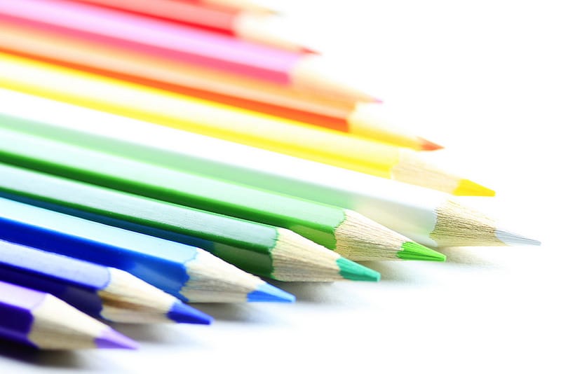
Below is a quick reference for some common colours and the feelings, emotions and behaviours they can trigger. check out color-meanings.com for a more detailed analysis of colours and their meanings
- Red– Power, energy, passion, desire, speed, love, intensity, celebration, luck, danger
- Yellow – Joy, optimism, happiness, danger, sunshine, idealism, imagination, hope, summer, philosophy
- Green – Nature, environment, health, good luck, renewal, youth, vigor, spring, generosity, fertility, start
- Blue – Peace, harmony, unity, trust, truth, security, confidence, conservatism, order, sky, water, cold, technology, cleanliness, loyalty, immortality, stability, masculinity and protection.
- Purple – Royalty, nobility, spirituality, ceremony, mystery, transformation, wisdom and enlightenment
- Orange – Energy, balance, warmth, enthusiasm, vitality, expansion, flamboyant, autumn and Halloween
- Gray – Safety, reliability, intelligence, melancholy, modesty, dignity, maturity, soundness, functionality
- Brown – Earth, hearth, home, outdoors, reliability, comfort, endurance, stability, simplicity, comfort, trees, nature and autumn
- White – Reverence, virginity, nothingness, cleanliness, peace, humility, precision, innocence, youth, birth, winter, snow, goodness, marriage, cold
- Black – Power, sophistication, formality, elegance, wealth, mystery, anonymity, unhappiness, depth, style, underground, technical
Pick a primary colour
Now that you know colours have meaning, you can use this as a sort of short-cut to your user’s brain. Upon seeing the colour of our app’s icon for the first time, the user will instantly make subconscious assumptions about your app, without reading a single line in the description.
This first impression is powerful, so it’s important to convey the right message in this oft-overlooked step. Do you want to convey professionalism and style? Maybe black is the right choice, like Uber. Or maybe you want to convey idealism and joy, in which case yellow might be the right choice, like Hailo.
Notice how both of these apps perform roughly the same function, but one feels distinctly more friendly than the other, something you might value in a service where you’re getting into a stranger’s car.
Once you know what we want the user to feel when they first see our app, it makes picking a base colour easy.
Use a colour palette generator
Efficiency and effectiveness is key when building a minimum viable product, you’re not here to spend weeks developing a unique and cutting-edge colour scheme, you need to get your idea shipped, so let’s not reinvent the wheel. Once you have a primary colour selected, simply use one of the many fantastic tools available to generate a colour palette.
There are a lot of color palette generators on the web, but my favourite at the moment is materialpalette.com
How it works
- Pick your primary colour based on the associations mentioned above
- Pick a secondary colour. Usually a contrasting colour is best so that it stands out, but you could also go with the more subtle approach and choose similar colours if it suits your app’s character
- Use the palette supplied. Either use it in your designs or share the link with your developer and make their lives that little bit easier
And just like that, we have a colour palette. The reason this tool is my favourite right now is that it doesn’t just give you a colour palette that looks great, but it shows you how to use it in this quick video from Google. As a client, this can help out your developer a lot in giving them a colour scheme from the start. As a developer, this lets you get back to writing code!
In summary
Don’t spend more time than you need on picking a colour scheme. It’s easy to get bogged down in these decisions, but just remember that your primary goal right now is to get something shipped, into the hands of your users and gathering feedback. So, next time you need a colour scheme;
- Quickly review the hidden meanings in colour. Remember that you can use these as a short-cut to the user’s brain and inspire feelings and emotions
- Pick a primary colour that compliments the goal of your app (to inspire action = red, convey professionalism = black, relax the user = blue)
- Use that primary colour to generate a colour palette using a tool like materialpalette.com
Did you find this post helpful? Let me know if I missed anything or if you have a different method for quickly getting to a colour scheme that works. I'm @cderm on Twitter ;)
Bonus
Feel like diving a bit deeper into colour and using it for your business’s brand? Check out this fantastic medium article from @nicknelo on twitter.
